
 -Focus is on Brookyln Decker, a supermodel.
 -She is dressed in black, contrasting against the white
background
-The dress is tight fitting and short.
-She is turned sideways, with her head tilted.
-The magazine's title is in the background, and partially covered by the model
-Biggest title is "Drop two sizes" -Second highlighted title is "Flat ABS! Firm BUTT! Lean LEGS!"
-The "Drop two sizes" title is aligned by her breasts
-"Flat ABS! Firm BUTT! Lean LEGS!" is aligned by her bottom.
-The "sclupt your body" title is in the shape of an arched back.
-"Eat more, weigh less" is aligned with her stomach.
-As your eye goes down the page following the dress, at the bottom it tells you about the style guide inside.
-Other titles surrounding her include, "Slim Calm Sexy Yoga" and "score time just for you"
Taylor Lautner-Men's Health

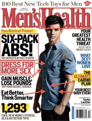
-Taylor Lautner is the main focus.
-Taylor's head partially covers the title
-biggest title is "Six-Pack ABS!"
-Second biggest is "DRESS FOR MORE SEX", located directly below the "Six-Pack ABS"
-Taylor is wearing a simple short sleeved, jean button up with dirt smeared on the shoulder closest to the camera.
-Other titles include, "Gain muscle, lose pounds", "eat better, think smarter", "The untimate cardio plan", "Your best body ever", "Your greatest Health threat", and "What sexy women love"
-His body is turned, however he is looking straight ahead.
-Half of his face is covered in a shadow.
Connections to others:
-all include ways to improve your body
-women's magazines focus on how to lose weight including diet and workout plans
-focused on appearance to others
-many include how to be happier, smarter, sexier
-all use a celebrity on the cover


In addition to the connections you named, I would also say text is a very important connection between your pieces. Each magazine has varying font sizes ranging from very large to very small.
ReplyDeleteThe text is also written in a short and to-the-point manner. The text makes the covers look pretty "busy"/crowded. However, it looks as though each magazine has one big topic they want one to read; these topics are shown in very large font and often in a bold color, too.
Good point. I guess i kinda overlooked the whole overall effect of the covers since I was worried about the things it said rather than how it looks as a whole. Thanks for pointing that out.
ReplyDeleteI liked the way that you highlighted the key elements by editing the image itself. Good job.
ReplyDeleteI too think it was very effective how you highlighted elements of the images with boxes and arrows to bring our attention to certain aspects. Also, I think that the imortance of magazine covers and what they say to consumers is often overlooked, but the promises they make and the text and images they present are what draws in an audience and attracts people to buy the magazine. There are so many magazines out there that have covers, images, and messages similar to these; this is a great topic, and good images to support it, for this assignment.
ReplyDelete